Agarwal Community App
One platform serving three culturally connected needs — business discovery, job hunting, and partner finding — without the experience ever feeling like three apps stitched together.
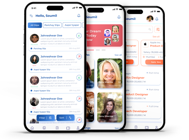
A close-knit community with no home base.
Members of the Agarwal community were juggling fragmented messaging apps and word-of-mouth to handle three recurring needs: discovering local businesses, finding job opportunities, and connecting with potential partners.
No unified, trusted, culturally-grounded space existed for any of it — so important connections kept slipping through scattered group chats and informal networks.
one platform
to tested prototype
testing sessions
before handoff
How might we design a single platform that serves three distinct but culturally connected needs — while keeping the experience intuitive and visually cohesive?
Listening before structuring.
I ran targeted user interviews with community members to validate assumptions about cultural grounding, privacy expectations, and how people actually browse for businesses, jobs, and partners. Alongside, I audited the informal tools the community already used — WhatsApp groups, directories, word-of-mouth referrals — to understand what trust looked like in practice.
The findings converged on two design-defining insights:
“I'll only create a matrimony profile if I control exactly who sees it.”
Members wanted strong privacy controls — most acutely in the matrimony context. Visibility had to be opt-in, granular, and reversible, with respectful, culturally-aware flows throughout.
“Jobs and matrimony are different worlds. Don't mix my feeds.”
Users expected the three areas to feel related but clearly distinguishable — not merged into one undifferentiated feed. The product needed hard edges between soft-linked spaces.
Three colour-coded modules, one mental model.
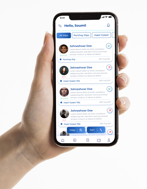
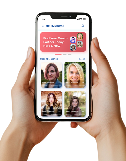
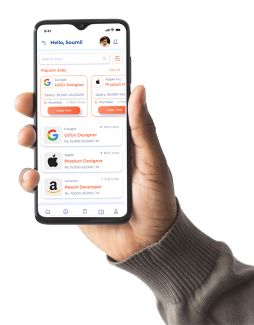
The information architecture answers both insights at once: the app splits into three modules, each with its own colour identity so users always know which space they're in — held together by one persistent navigation pattern and one design language. Sitemaps and user flows were validated against the interview scenarios before any visual design began.
Business
Local business listings, profiles, and networking between community members and merchants.
Matrimony
A privacy-first partner finder with controlled visibility and respectful, culturally-aware flows.
Jobs
A community job board connecting members to roles and employers they already trust.
Atomic components, accessible by default.
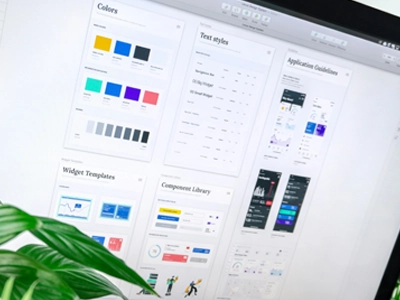
From wireframes I moved into a modular, atomic design system — Poppins / Inter typography paired with custom SVG iconography, holding a 4.5 : 1 contrast ratio throughout to meet WCAG accessibility standards. Each module inherits the same components; only the accent identity changes.
Tested in the wild.
I put the prototype in front of people: guerrilla testing with 6 users across 2 iterations. That surfaced real friction no amount of internal review would have caught.
Found: module confusion
Some users lost track of which module they were in when navigating deep into content. Fix: persistent colour-coded tab navigation and clearer module headers, so orientation survives any depth of navigation.
Found: slow image uploads stalled key flows
Business listings and matrimony profiles both depend on photos; slow uploads made users abandon setup. Fix: lazy-loaded, backgrounded image uploads with optimistic UI, so the flow never blocks on the network.
Found: flat interactions read as “unfinished”
Testers hesitated on actions without feedback. Fix: purposeful micro-interactions on primary actions — sent slips, saved listings, shortlists — that confirm state without slowing anyone down.
Friction, designed out.
Persistent tab navigation, micro-interactions, and lazy-loaded uploads resolved every usability issue uncovered in testing — turning three culturally connected needs into one coherent, intuitive experience that respects the community it serves.
one mental model
real usability friction
for accessibility
closed before handoff