Client: Agrawal Welfare Foundation
Role: Lead UI/UX Designer
Team: 1 Product Manager, 1 Frontend Developer, 1 Backend Developer
Tools Used: Adobe XD, Figma (Prototyping), Zeplin (Handoff)
Timeline: 4 Weeks
Platform: Mobile-first (iOS + Android)
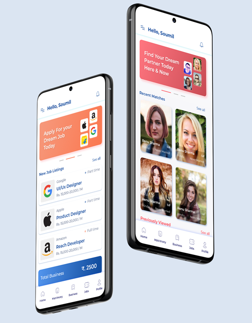
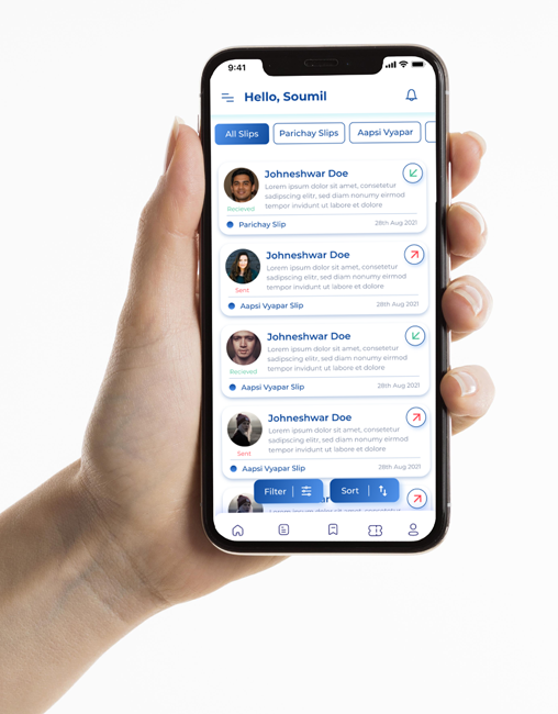
A multifunctional community app designed to connect users with local businesses, job opportunities, and potential partners—streamlined into one intuitive platform with distinct color-coded modules for clarity, trust, and seamless user experience.
Communities, especially immigrant and cultural groups, often struggle to stay connected beyond messaging apps. There’s a lack of centralized digital platforms where people can:
How might we design a single platform that serves three distinct but culturally connected needs — Business Discovery, Job Hunting, and Partner Finding — while keeping the experience intuitive and visually cohesive?
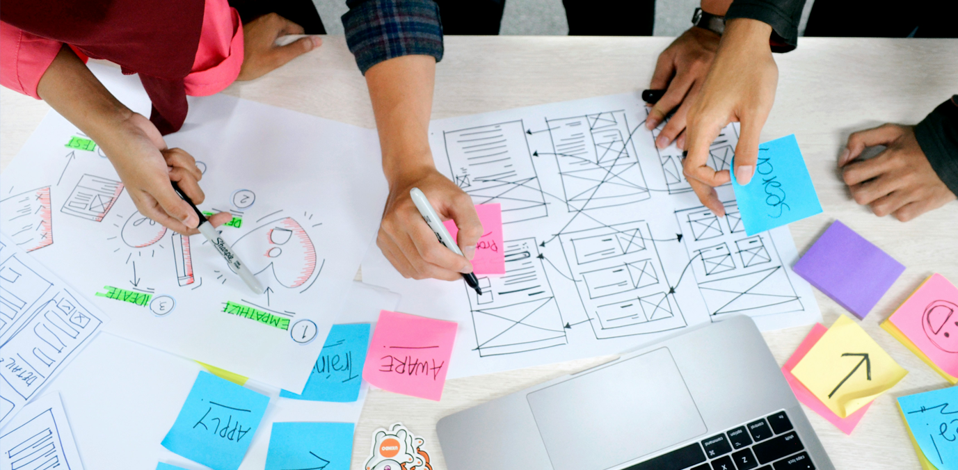
Due to time constraints and budget, I conducted targeted interviews from community circles to validate assumptions.
I structured the app around 3 primary Components
Business Listings & Networking
Royal Blue
Trust, Reliability
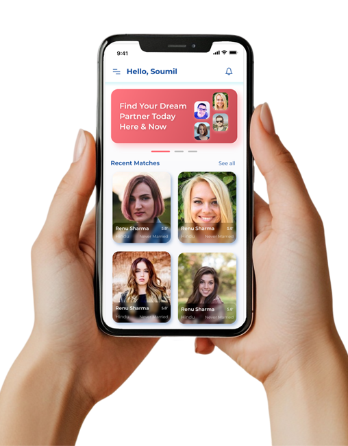
Matrimony/Partner Finder
Coral Pink
Warmth, Emotions
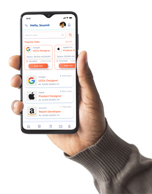
Find/Post Jobs
Peach Punch
Energy, Enthusiasm
I conducted guerrilla testing with 6 users across 2 iterations.
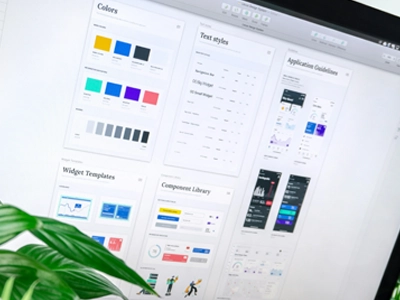
Created a modular design system using atomic principles: